

Graphic Design
For my final university project, I wanted to push myself as I felt that I had got comfortable just designing digitally. After extensive research in to the Marvel brand and their character, I made a set of 3 A2 posters that used mixed media to represent 3 different Marvel characters and their character themes. I used techniques such as laser cutting and screen-printing as well as elements such as the corner boxes that used to be a staple to the covers of Marvel comics. As these were inspired by the comics, I decided to frame the posters by creating acrylic cases that looked like "slabs", a way of preserving comics where they are then also graded based on their condition. I feel like I effectively captured the essence of the comics as well as creating an outcome that I was not only proud of but also pushed me to create something unique and physical rather than just basic and digital.


As a part of the research portion of my major project, I spent a lot of time testing different mediums using some of Marvels best comic covers. The testing including risography, screen-printing and laser cutting. The laser cutting fascinated me most, engraving flat comics as well as creating 3D versions of the comics that took multiple layers of cutting and engraving.


As a part of one of my university modules, I had to approach a local business and work on a live brief based on things they needed. I approached a local comic shop that had recently been taken over as the previous owner had recently retired. They required a complete brand overhaul, including logo, signs, social media and guidelines.


This is an ongoing personal project of posters inspired by my love of TV and film as well as the Swiss art style. I Have created a number of different designs that include the titular character of the show (or season of the show) and included the episode titles as well as a selection of the cast.


This collection of work was part of a university module titled "Ethical Design", with the brief asking us to look at a way we can effectively use design to have a positive impact on a real-world issue. I decided to create a series of collectible cards that had some of cinemas most uplifting and inspirational quotes as a way to help people deal with their mental health. The concept project would be sponsored by the BBFC and Mind, encouraging people to watch films as a way to help deal with their challenges, something I personally resonate with.


This collection of work was part of a university project that had us follow the 2025 ISTD brief, Not Just Fleurons. The brief wanted us to look at plants, focusing on their forms, colours, shapes and any other interesting features we could find. I decided to create a book that focus on a selection of "weird plants", looking at ones that go against the traditional image of a plant, allowing me to explore some fascinating shapes and forms.


This collection of work was part of a university project based on the text Undersea by Rachel L. Carson. Our brief stated we had to create a book that focused on a typographical outcome, rather than a graphic based one. With this, I decided to use my photography and graphic design skills to create an outcome that used both aspects effectively, creating spreads that integrated type in to the photographs seamlessly.


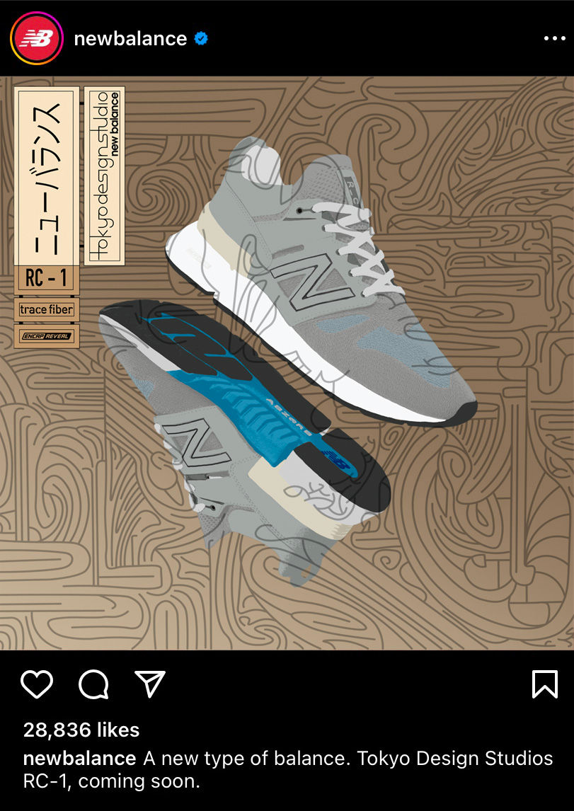
This collection of work was part of a university project based on a real brief surrounding Tokyo Design Studio (a subsidiary of New Balance) where we had to create a brand identity for the company. Taking inspiration from neon sign culture, the Jomon period and Ukiyo-e art, I created a basis for an advertisement series surrounding the release of the RC-1 shoes
This collection of work was part of a university project based on a real brief surrounding Tokyo Design Studio (a subsidiary of New Balance) where we had to create a brand identity for the company. Taking inspiration from neon sign culture, the Jomon period and Ukiyo-e art, I created a basis for an advertisement series surrounding the release of the RC-1 shoes


This collection of work was part of a university project that focused on negative space and type and how effectively they can work together. The piece on the left was printed as an A3 poster with intention to go in a Mac suite to assist people in learning typography. The piece on the right was intended to be an article about the use of white space and how effective it can be


This collection of work was part of a university project that focused on Portsmouth. For this I illustrated some line drawings of various iconic landmarks around the city and turned them into anaglyphs using the Portsmouth city emblem and repetition of the word Portsmouth


This collection of work comes from a college project where I created a concept cinema under the name "Flashback Flicks". This would be a pop-up cinema where movies that have been previously released would be played exclusively and would constructed within old, shutdown stores that are now vacant. with this my favourite film is Baby Driver so I decided to plan a big opening night event with related, exclusive items. this included a small VHS Box that I custom designed with various styles that would contain the tickets, some postcards, stickers as well as a strip of film


